Spatial Awareness
Building upon the Windows 8 Start Screen
OCT 2012 - OCT 2013
The challenge
Windows 8.1 was a relatively quick release cycle started before Windows 8 hit the shelves. As the UX Designer who inherited the Windows 8 Start Screen, I was tasked with finding the best improvements we could fit in the time and resources we had for the experience.
My responsibilities
Partner with UX Researchers
Collaborate with Core Personality designers for visuals and motion
Create design flows and redlines
Explore concepts with prototypes
Organize brainstorms and critiques
Communicate and advocate for designs broadly for general awareness and buy off
Goal
Make it easier to find and organize apps on Start
Given a long Start Screen of 100+ unorganized app tiles, how can we help users best find the app they are looking for, even if they don't remember the name.
Easily manage newly installed apps
Solving the problem head on
We began by taking inventory of existing user patterns, and building our understanding of the mess of tiles. We found that many users would take the time to pin their favorite apps to the left. But as new apps were added to the end, the organization became murkier and unclear. Unused, unrecognized, and unneeded tiles (Start Crud or S'crud as we called it) would intrude and clutter up what was intended to be a personalized experience.
While Search is always a great way to find your app, we were explicitly targeting users who either didn't remember the name or much about the app, or simply preferred to browse. We focused on two main attack vectors: helping you keep your apps organized as well as helping you in the moment that you can't find the app that you are looking for.

When apps are submitted to the app store, they are categorized. What if the Start Screen remembered these categories, and allowed you to filter or highlight apps of a specific genre?
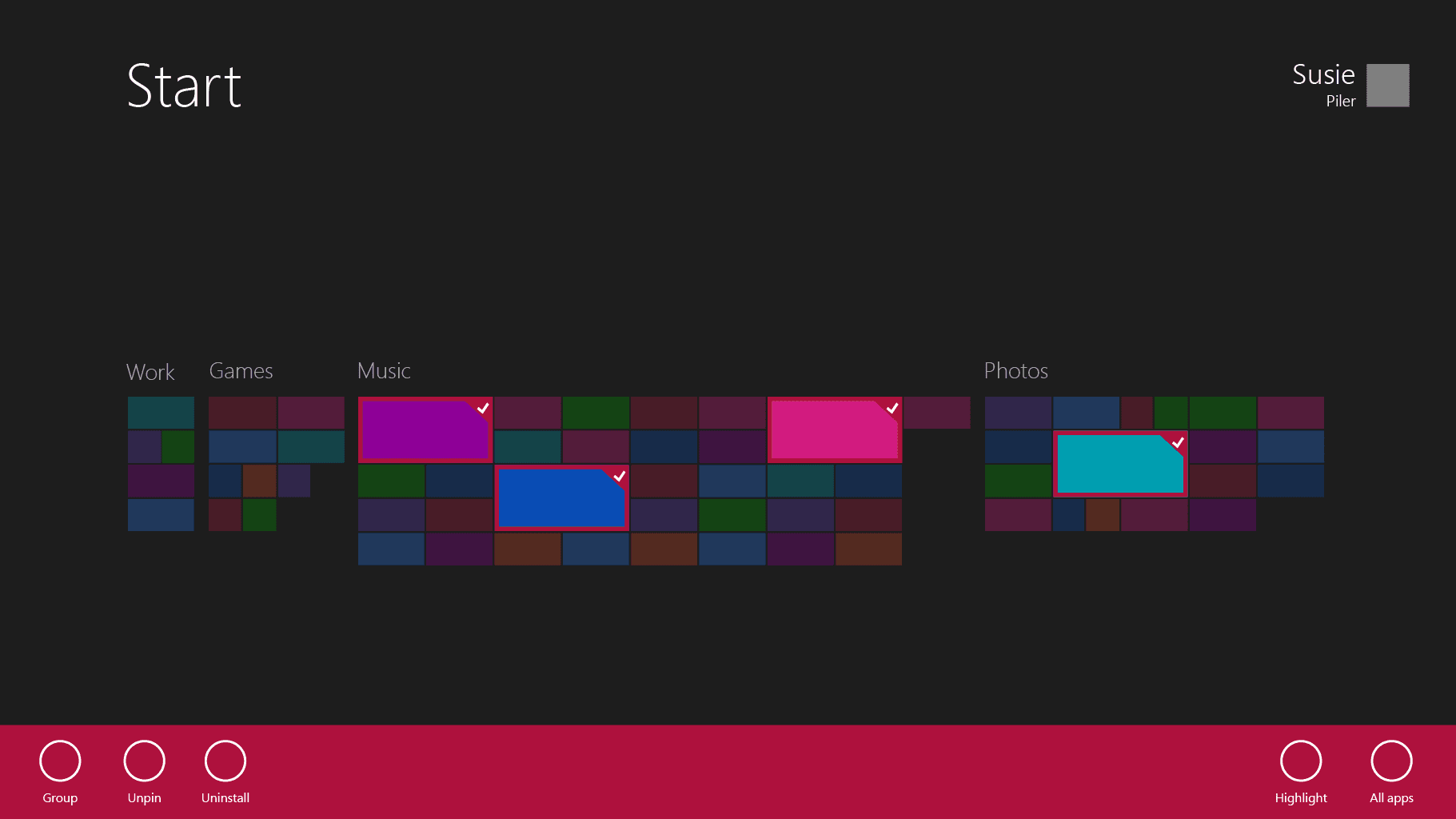
One of the many explorations I created explored using size and opacity to highlight your apps inline, thus teaching you where your apps were, and providing helpful commands such as 'Group' to allow you to clean up your tiles.
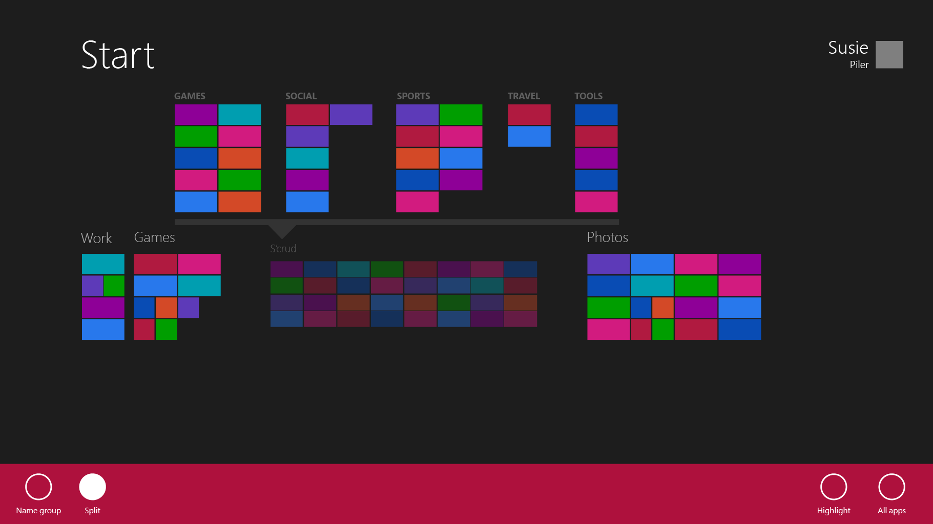
Another example allowed you to dissect the 'dna' of a group, seeing what type of apps made it up. From here, you could easily move apps based on category, or reorganize your Start Screen
Approaching the problem from the source
At the time, apps automatically pinned themselves to Start when you installed them from the Store. This meant that if users wanted to keep their Start Screen personalized to their favorite apps, they would have to consciously remember to unpin apps. And once you unpinned the app, you had to know how to go to the All Apps view to find it again.

To view unpinned apps in Windows 8, you had to swipe up from the bottom of the Start screen to bring up the app bar, and tap on "All Apps" to navigate to the All Apps View. Many users had a hard time finding this, which was some of the rationale that lead to the decision of pinning apps automatically to Start.
However, Start was supposed to be a highly personalized space for users to have quick access to their favorite apps. The experience heavily relied on Spatial Organization—an extremely strong tool for a very limited number of items. Users would form muscle memory for their few favorite apps, but the system is quickly overtaxed with too many items.
In order to reduce the number of items on Start, I decided we shouldn't pin apps to Start automatically. To stop pinning apps automatically, I needed the All Programs view to be easier to access. While we brainstormed a large variety of models, we landed on the simple 'upstairs/downstairs' model.

Both Start and the All Programs view (APV) scroll independently. A simple vertical swipe allows you to switch, with a threshold for snapping.
Improving the Rearrange Experience
In Windows 8, to select a tile, you would flick it in a direction opposite from the scroll direction. This gesture was called 'Cross-Slide'.

A quick flick down on a tile would select it in Windows 8
To rearrange a tile, you had to start the flick, but pull past a certain threshold before the tile would snap free and allow you to move it. You could also only move one tile at a time.

To move a tile in Windows 8, you had to cross-slide, and then continue 'pulling' the tile until it snapped free. At that point it would follow your finger and you could drop it where you wanted.
Unfortunately, this cross-slide gesture would conflict with our Upstairs/Downstairs models for Start. In addition, there was feedback that this gesture was confusing to users. While I understand the benefits of avoiding timed gestures, I advocated that in this case, Press & Hold was enough of an established standard that it mitigated many of the concerns. Once I got buy off on Press & Hold, I worked with my PM partner through all of the details of the rearrange state, as well as being able to multi-select and move multiple tiles at once.

In Windows 8.1, you could now press & hold to enter a rearrange mode. Not only was this what our users expected, but you also had a more robust experience where you could multi-select and move many tiles at one time. I spent a lot of time polishing the details of this experience down to the milliseconds—from how long it took to enter the mode, and how easy it was to move tiles in the mode while still preserving the ability to scroll the screen.
A quick screen capture of the shipped Rearrange experience.
Personalization
I also worked on a number of other features around personalization of Windows.
Color Picker
Windows 8.1 added a number of new backgrounds to the Start screen. One of the desired ways to make Start more personal was to allow users to customize the colors used. We chose to base all color themes on two colors, the primary and accent. My main goal for the experience was to offer a wide enough range of colors in order to feel 'infinitely flexible', while keeping the color picking option simple and obvious. We didn't want the average user to have to understand different color models (RGB, HSV, etc.), nor have to tweak multiple sliders to get the color they were looking for.
From these two colors, Windows generates hundreds of other colors for various surfaces and uses across the OS (text for errors, notifications, etc.). I worked closely with the team to help determine good algorithms to generate these colors while ensuring they all passed accessibility guidelines.
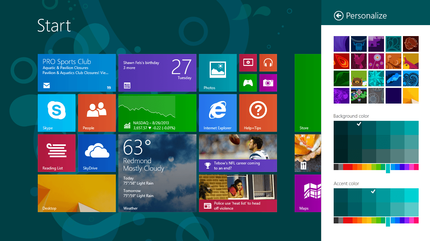
You could access the Color Picker via the Settings charm on the Start screen. This was done in part to allow users to see the changes happen live (as we had some restrictions around being able to render a Start Screen preview within Settings).
Lock Screen Photo Slideshow
Another feature I helped out with was to allow users to turn the Lock Screen into an autogenerated photo slideshow.
A quick screen capture of the shipped Rearrange experience.

The Settings experience for the Photo Slideshow feature.
Key takeaways
It is hard to pinpoint everything I learned from working on a team and product with the scope of Windows. Having to consider hundreds of languages and thousands of form factors, decades of legacy, and the realities and impact of an operating system is humbling. With a premier surface like Start, there is always a trade off between doing what is right for our experience, and setting expectations and standards for all of the third-party apps created for the platform.
In this project, I learned about how to navigate large teams, being able to convince the right people in order to have large-scale impact. It was also very important to evaluate what was important and mattered enough to push through.